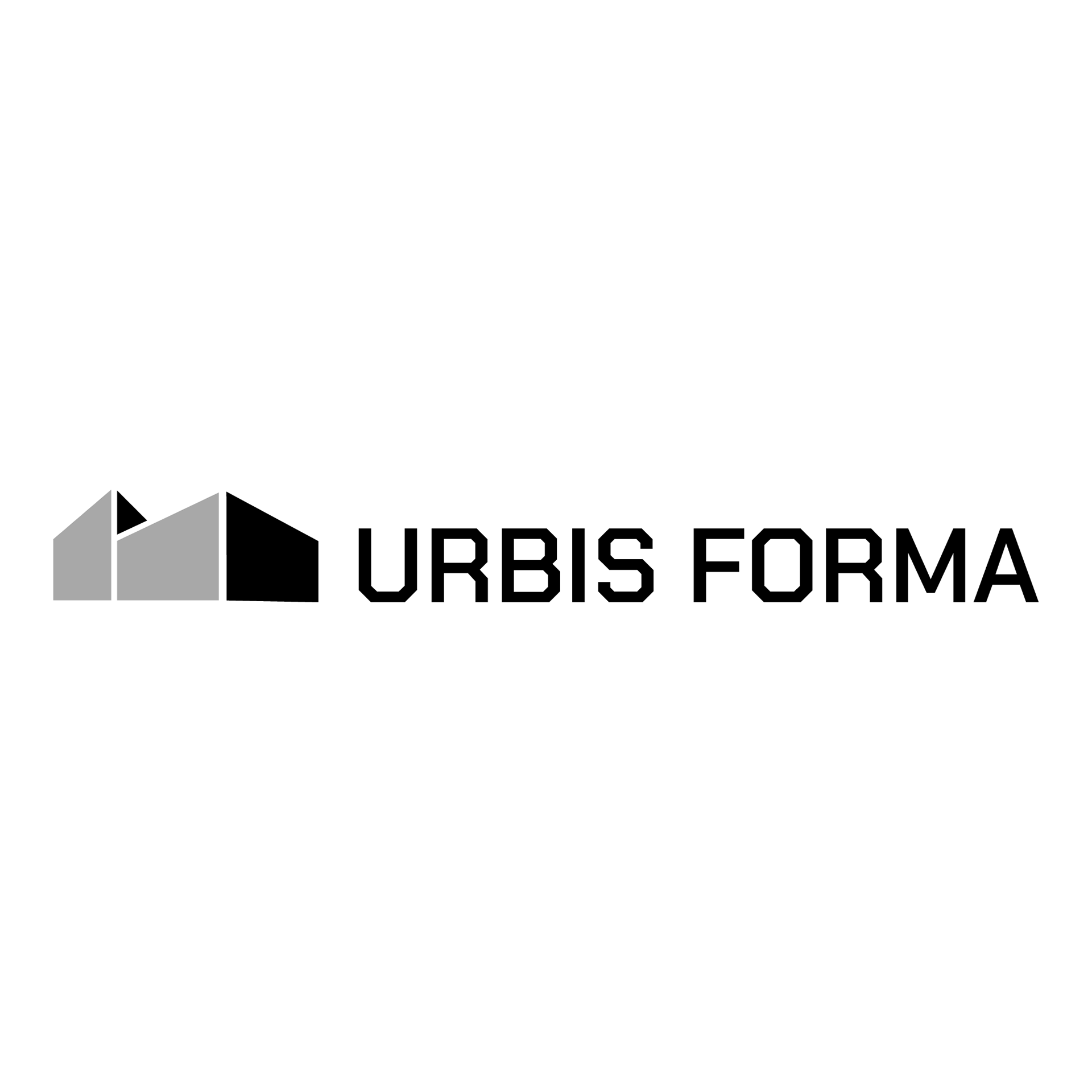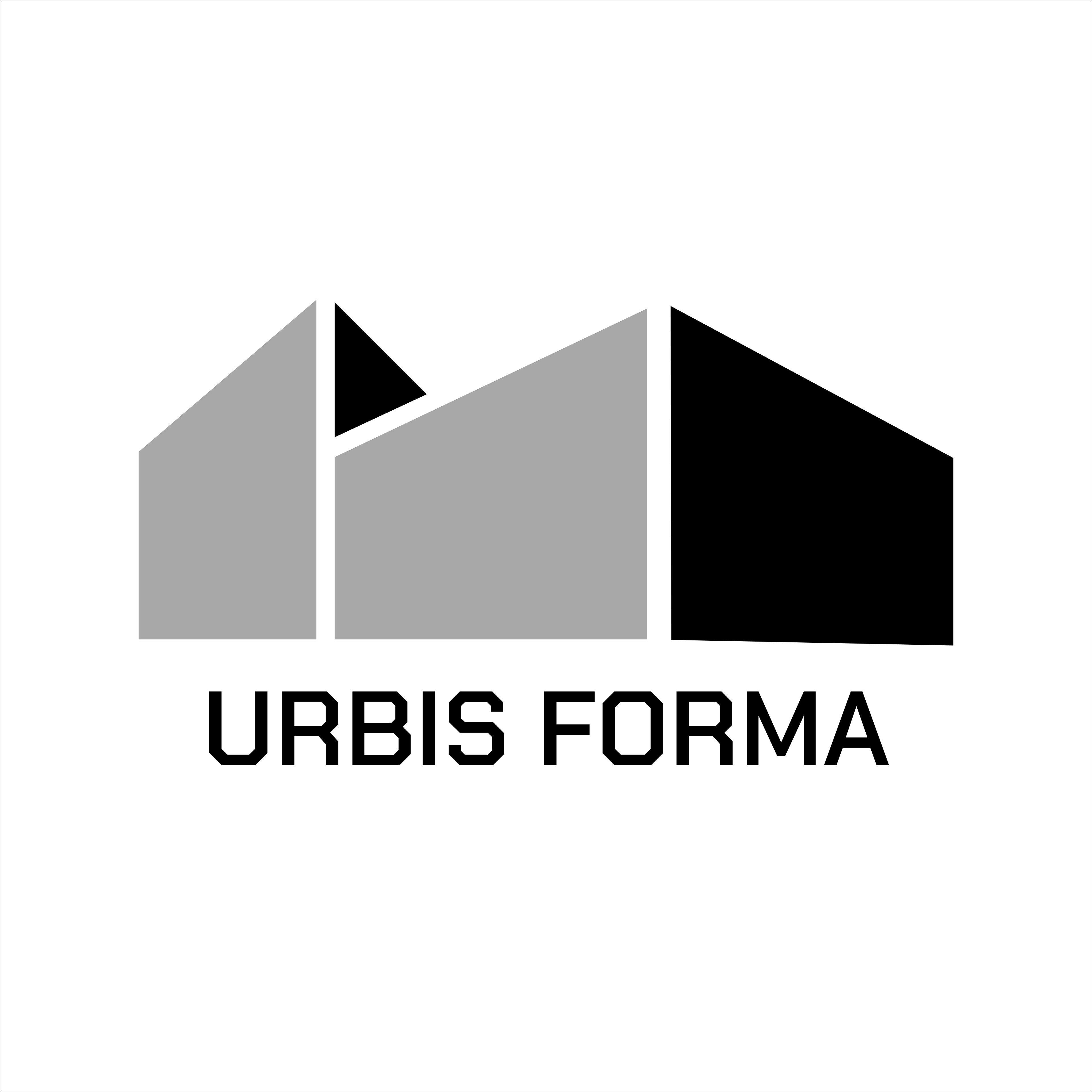
Project Overview
A branding exploration created for Urbis Forma, a concept rooted in modern architecture, urban design, and intentional form.
The goal was to create an identity that felt sophisticated, structural, and timeless—something that could live comfortably across digital, print, and environmental applications while still carrying a strong visual signature.
The Brief
The client needed an identity that reflected a forward-thinking design philosophy rooted in urban space, architecture, and intentional form.
The logo needed to feel: Modern, Abstract, Simplistic, and Distinctive.
Beyond aesthetics, the mark needed enough flexibility to live across digital applications, print materials, signage, and future brand expansion without losing recognition at smaller scales.
Key challenge:
How do you communicate architecture and form without relying on overused visual clichés like buildings, rooftops, or construction symbols?
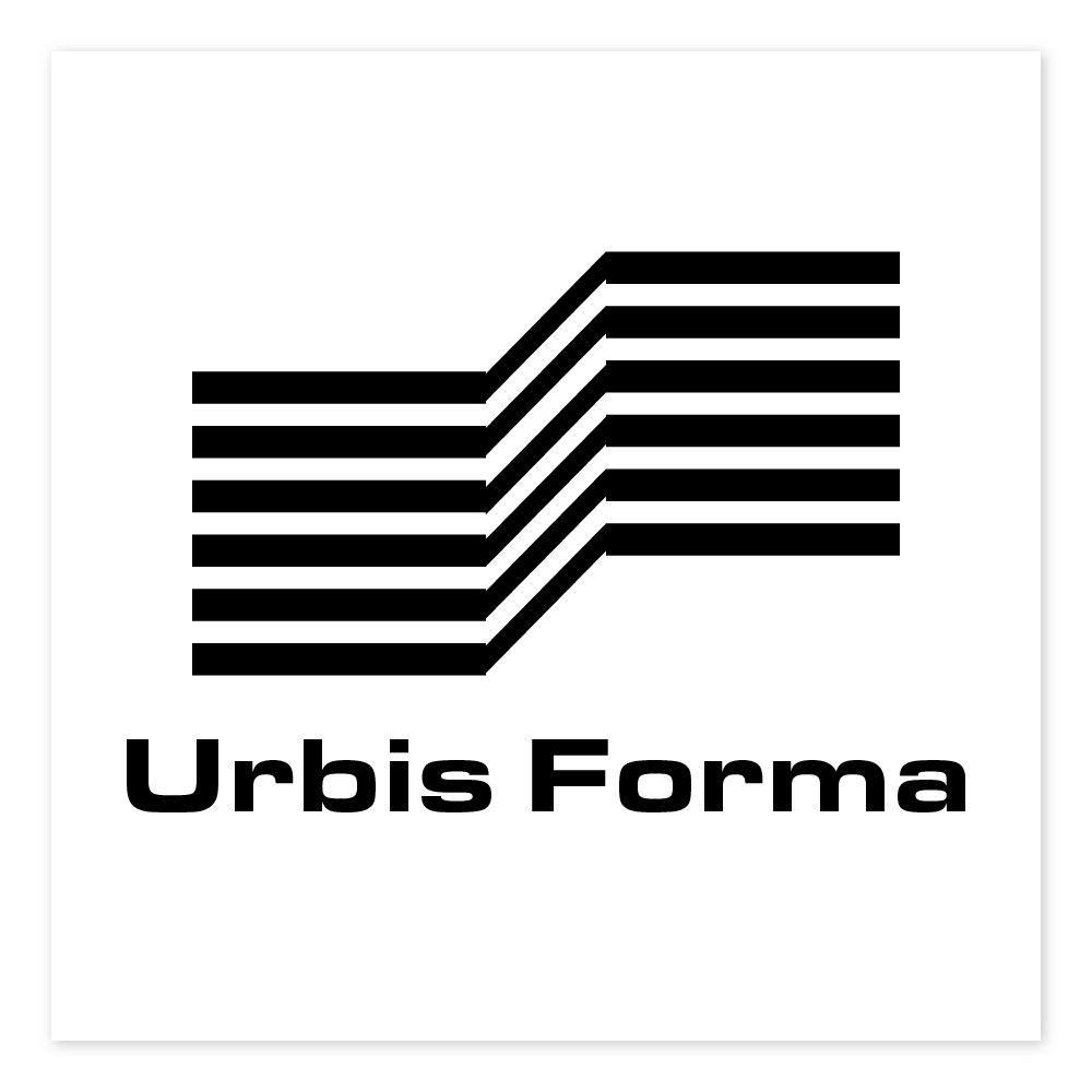
Direction 01 — Structural Rhythm
The first direction explored architecture through repetition, linework, and movement. Using parallel horizontal forms and angled transitions, this concept aimed to represent:
Structural systems
Urban pathways
Flow between spaces
The relationship between rigid design and movement
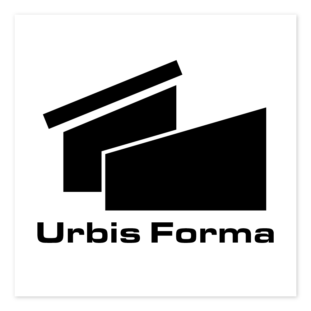
Direction 02 — Architectural Form
The second direction pushed toward a more literal architectural interpretation.
By introducing layered geometric forms and intersecting planes, this concept explored:
Building silhouettes
Spatial overlap
Exterior structures
Dimensional perspective
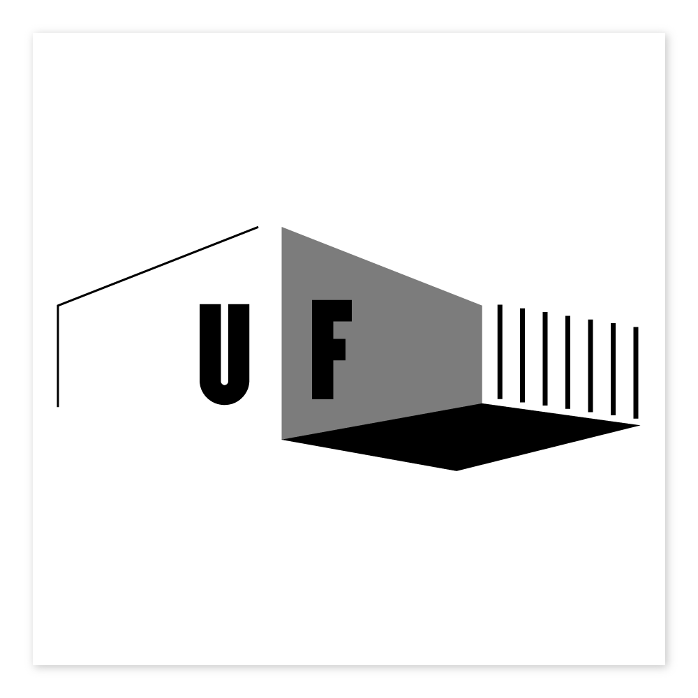
Direction 03 — Spatial Identity
The third exploration shifted from representing buildings to representing space itself.
Instead of focusing on exterior structures, this concept explored:
Interior perspective
Negative space
Environmental geometry
The emotional feeling of entering a designed space
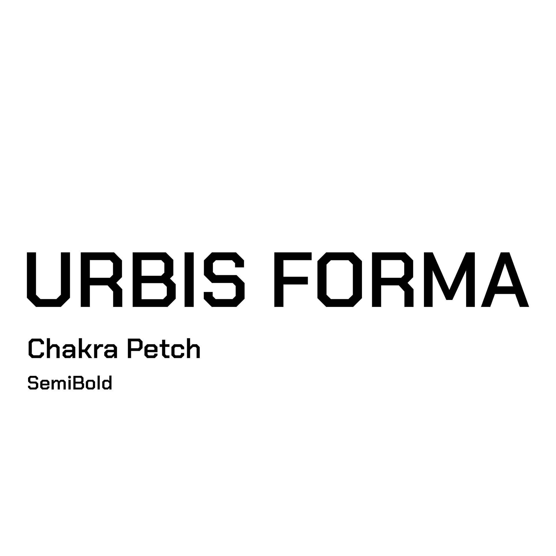
Typography
Selected a type direction with clean geometry and modern proportions.
Refinements included:
Custom kerning adjustments
Weight balancing across characters
Optical spacing corrections
Unique character modifications for distinction
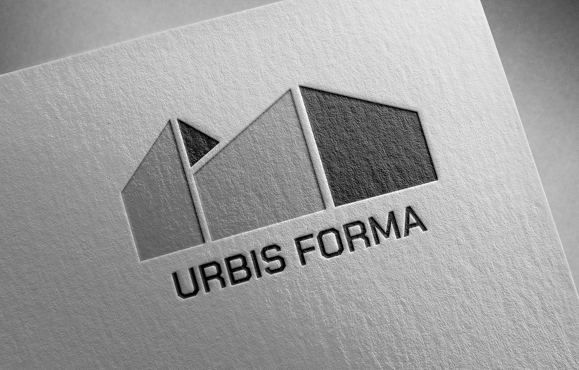
Refinement Process
Several rounds of iteration focused on:
Proportion
Adjusting the visual balance between symbol and wordmark.
Scalability
Testing the logo across various print and digital media.
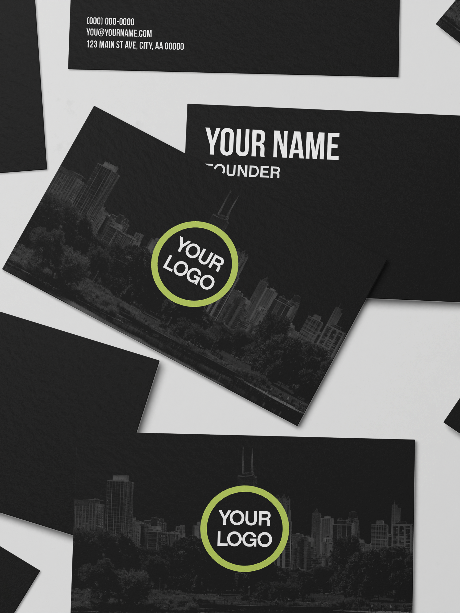
Versatility
Creating versions and mockups for necessary occasions.